Thursday, 16 November 2017

Art fundamentals week 6 part 1


Hello blog

This image is a piece of concept art from the film Guardians of the galaxy with  the artist likely being a MARVEL employee. For me this is interesting because it is art based on science fiction, For me this is interesting because science fiction is a genre filled with creativity and endless possibilities which aspires me to do more and always be creative to a piece of art. This piece of art is  analogous. This is because it consists of the same colour but uses multiple shades of it. Furthermore I find it inspiring because science Fiction is my favorite genre. In addition to this this is literally inspiration for a VFX  product being the planet Xandar.

Art Fundamentals

Hello blog

For this weeks assignment we were asked to draw a face at 3 different angles; at eye level, above eye level and below eye level.

The first drawing i did was at eye level. Whilst doing it i noticed it is by far the easiest one to do. Unlike this though the other two i struggled more on which is likely due to the perspectives they had to be in.


On the whole i am rather pleased with this as i believe i have done well for myself as the drawing resembles the person i drew as well as using all three perspectives effectively. If i had to redo this assignment i'd focus alot more onto the above and below eye perspective as they could overall use more work.

Tuesday, 14 November 2017

Next Gen year 1 week 8

Hello blog

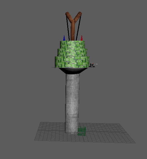
This week I was given the task of creating my own tower and to sculpt it on MAYA. Before i were to do this though i had to go on Photoshop to create a tower out of already existing images, known as photo bashing. For this I placed a picture of a water tower and added other images to it to create a weird fantasy tower.

When making the tower I started by adding in all of the objects to overall resemble the shape. Then from there i went into to details, specifically building a small turret on the side. Overall on this project  creating the turret was the most time consuming part because it was the most detailed as well as the fact i allocated a lot of time to the base of it. Then from there I went on to texture it which was the easiest part as i didn't run into too much trouble whilst doing it.

Overall i Believe i used an okay amount of techniques and methods whilst creating it. I also like the turret I added to it mainly because of how that is what i spent the most time and went in depth to.

If i had to redo this I would allow myself to spend more time on Photoshop photo bashing to come up with a more creative tower. In addition to this if i had more time i would use it to create reflective windows to make the tower more realistic.

Monday, 13 November 2017

Art fundamentals

This image is analogous. This is because the colours  in the image mostly consist of different shades within the same colour. I chose this because of the multiple hues of colour creating the desert. The colour wheel even shows this as the pigments are all shown next to each other.


This image is complimentary because it is made up of 2 distinct colours which blend well together. I chose this image because of how vibrant the 2 colours are.


This image is triadic because it is made up of many vibrant colours. I chose this fine piece of art because there are hues of red and blue which really cause the image to stand out. This colour technique is primarily used in cartoon and more animated styled video games and films. This is due to the fact it focus on showing energetic colours.

Thursday, 9 November 2017

Art fundamentals


 Hello blog

for this art fundamental assignment i was given the task of drawing out peoples positions whilst effectively using scaling figures. For me overall i much enjoyed it as i beleive i have used a wide range of peoples stances and positions. The negative of this piece is some figures came out better than others but this can be easily ajusted for me as the only way to improve on something like this is with time and improvement.


Tuesday, 7 November 2017

Next Gen year 1 week 7

Hello blog

Today in MAYA i was taught more about textures and bump mapping. Bump mapping is choosing a texture to add to your object like granite or leather resulting in the appearance differing due to the new texture. in addition to this we were also taught other special effects and options possibly required to texturing an object..Afterwards the class was split up to each create 1 of the 4  elements assigned to them. For this i was assigned the element of fire. For this i created 4 generic spheres. I individually changed them all to create 4 un-identical spheres which each resemble fire by having different bump maps, transparency's and glowing effects to create my final product after rendering it.
Before render
After render


On the whole i am proud with how it has turned out as the orbs represent the same element whilst also using varied effects. Overall my biggest negative for this occurred in the pre production phase of the assignment as when it was set it took me a while to comprehend what the task was but as i got on i found this to be a fun and simpler task.

In the next day on MAYA i was doing character rigs and animating them into poses. For this I was shown 2 poses and had to move the character rig to fit them. The poses i were given was a high jump kick and a bicycle kick which i replicated. Whilst doing this i found it entertaining. Despite this whilst doing it i found moving the characters legs a nightmare as they would just reset sometimes causing me to repeatedly attempt to fix it.


Thursday, 2 November 2017

Art fundamentals

Hello blog

This time my assignment was to draw two rooms, one being in 1 point perspective and the other being 2 point perspective. During this activity i found it hard to concieve but as i knuckled down it became more clearer for me. Whilst doing it the hardest part was shaping it into my rooms and adding notable detail. If i were to do it next time i would include shading as well as lighting for shadows as well as add more 3D objects to make the peice stand out more.


Artwork